Black White and Gray Master Bathroom Remodel [Quarantine Project]
SCROLL TO BOTTOM FOR LINKS
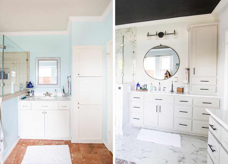
Just a couple of weeks before shelter in place made its way to Dallas, I had signed off and made a deposit on a new master bathroom remodel. This is a project I have waited 8 long years for. When we moved into our home just weeks before Alivia was born we knew it was a project that was going to have to wait. For the time being I picked a color we thought complimented the lovely orange marble floors, spray painted the brown mirrors silver and let the waiting game begin (I never even spray painted the light fixtures, I really thought it wouldn’t be long before they were gone). But being that this entire house was a 1990’s time capsule there were MANY other things on the list that were more pressing. Every time we’d think we’d saved enough to tackle it, something else would happen or a part of the house with more visual would take priority and this would move back to the bottom of the list. Last summer we ended up spending the money on the backyard project (which was totally worth it, especially during covid!).
When we bought the house….
Our quick edit
Our “spa” blue chosen to accent the orange marble and spray painted mirrors.
Just as things were starting to amp up, I watched other states start slowly closing down. I made a panic move and went to EVERY single tile and floor store I could find until I picked out the tile and all of the paint colors. I knew everything else I could order online, and I wanted to make sure our guys could get to work if they were allowed. Sure enough, DFW came next and praise be to God all construction was considered essential, so they all were still allowed to work. Four weeks of homeschooling was met with the sounds of drills and jack hammering and special smells. And all of it was a complete blessing. Each worker thanked me for not canceling because they needed to continue to work, and the project kept us all busy and occupied making the days pass by quickly. We used the upstairs guest bathroom, the dining room and guest room as our closet and made a “fun” game of our life being turned upside down distracting the little ones from the real craziness going on. Major shout out to Tom at Floors Up for being awesome and doing everything possible to keep this project moving.
One of the other reasons I went back and forth for so long choosing to do other projects over this one is mostly because I felt guilty knowing that my bathroom was fully functioning. The sole reason for the project was aesthetics and my desire for a “pretty” space, which really tugged at my heart. But THEN!!! The lovely 30 year old oak tree outside my window decided to grow under the house, into our plumbing, and pushed this lovely orange tile up off of the floor. It’s hard to see in the pictures but many tiles were cracked into pieces and when you walked on them they were uneven and bowing. We had to install a root barrier under the foundation, then wait for the roots to dissolve enough that it wouldn’t affect the new one. I told Nick I think it was God’s way of giving me permission to not feel guilty about spending the money on something so wordly. #whatevermakesmesleepbetter
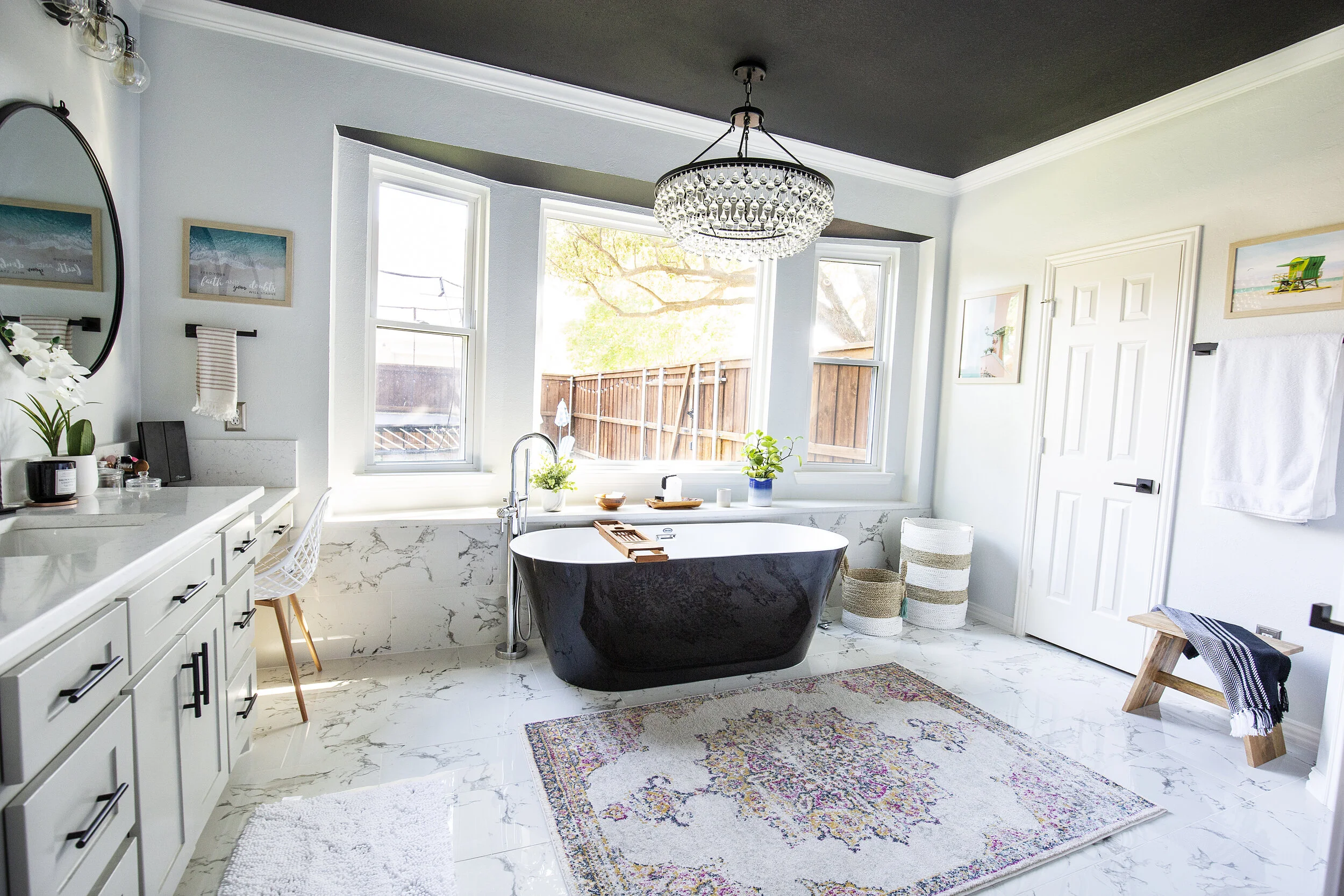
I must have changed my mind 100 times on what I actually wanted to do. Most of my Pinterest board (from the past 8 years) was filled with bright whites, marble floors and crystal chandeliers. I kept some of that, but the more I searched the more I went crazy for black, especially black tubs and black ceilings. Every time the contractor checked in with me on paint colors he would double check… you want, black? For the ceiling? Just like convincing Nick to let me make the office white all over again. But I promised him if we hated it we’d paint it back to white, after all it’s just paint!
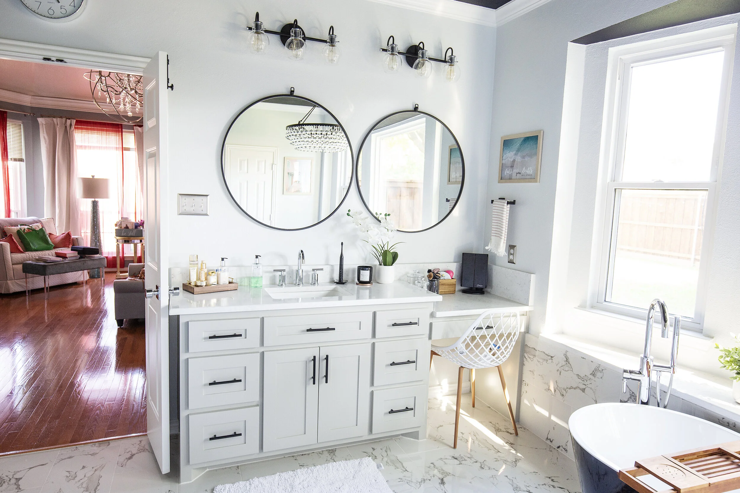
We went with Sherwin Williams “Tricorn Black,” which is the same color we used on our mantle, staircase banister, office doors, interior front door and some accents on the exterior of the house. The wall color is the same as the office, Sherwin Williams “Nebulous White.” However, I have to say, if I had to do it all over again, I’d make the walls a brighter white. The office it looks more white, so I assumed it would look great in here as well, but the black ceiling casting down on it makes it look much more gray than white. It’s growing on me but if I could go back I’d alter it. I also went back and forth on the cabinets, thinking I’d make them white. But dang if all of those pinterest boards and wanting to break out from the norm didn’t make me change my mind. In the end I went with Sherwin Williams “Mindful Gray” and I love the way they turned out! I finished them with black matte cabinet pulls from Amazon and love them!
The “Before”
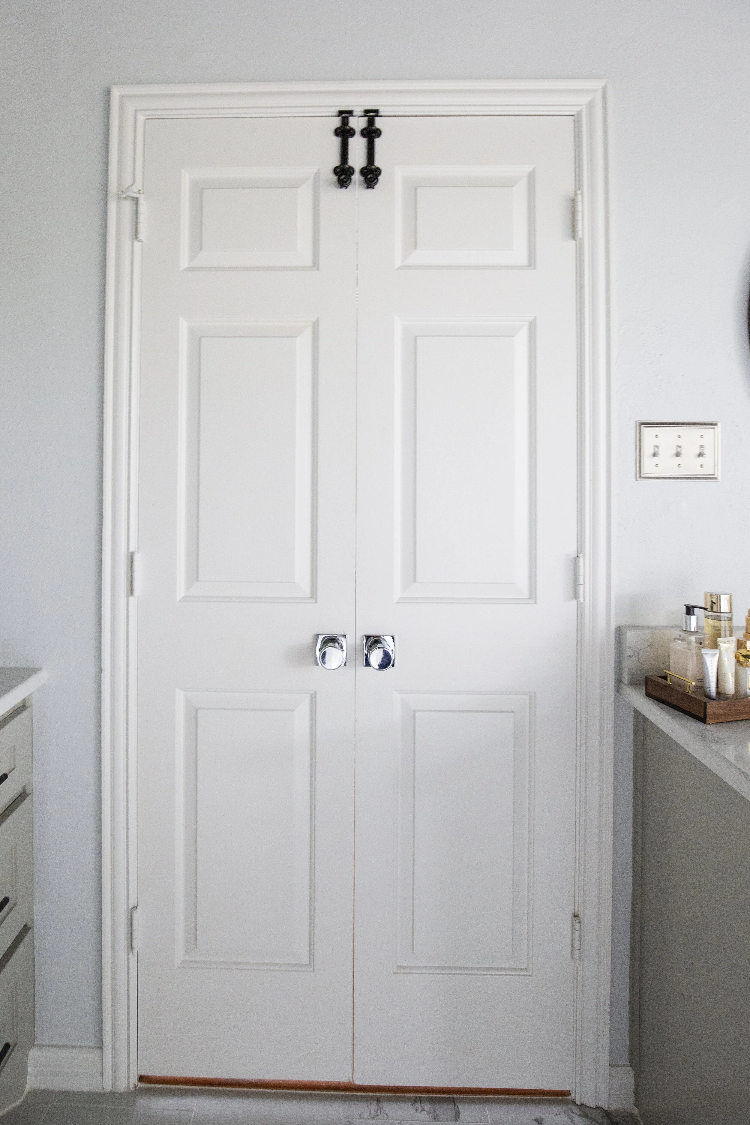
Another huge plus in this makeover project was more space! Poor Nick’s solo sink was lacking in the counter space department, mostly thanks to a very odd closet that opened in three places, was lined with mauve pink carpet and was filled with wasted space. My counter was actually shorter than the standard height, and being that I’m 5’9 with major back problems I was stoked to bring those up higher. And, although I loved my super huge bathtub and would have loved to find a giant black freestanding tub, it didn’t quite exist. I found as big as I could, ditched the mega tub and ended up with more room for a rug (that we now do morning stretches on, LOL.) Nick’s favorite change was adding a door to the toilet space. We went 8 years with not only a doorless toilet, but NO LOCKS on the main french doors either. Ohhhh buddy, in the new bathroom we got BOTH!!! Dreams do come true.
And the “after!”
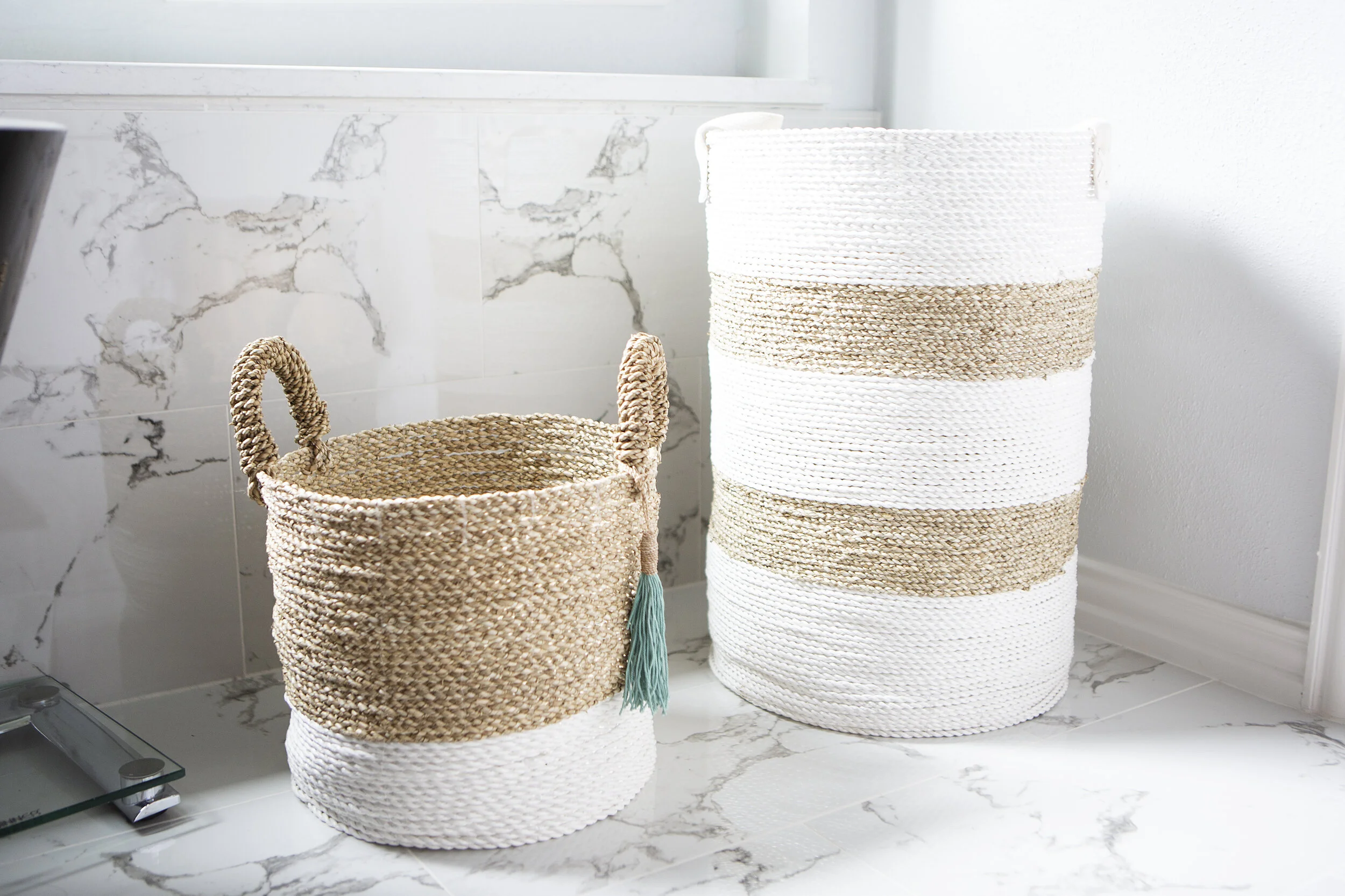
There are SO many things to be excited about ya’ll. A fun chandelier, door locks, art, more space, but how about that tile behind the toilet. I really wanted to do something FUN and add a little hidden pop for when the door was open. I got these black and white tiles from Home Depot and absolutely love them. We mixed black and white with chrome faucets and accents. I couldn’t quite commit to black faucets forever, and I loved the way the metals mixed in the little details of the light fixtures. Then I brought in natural accent pieces to soften it up.
Everything is linked at the bottom of the page.
I even finally found a place in the house to hang my “fruits of the spirit” wall art. I figured no better place to be reminded of how God wants us to be than the spot we visit multiple times (alone and quiet I might add). I have to say before I got to shop for accent pieces I kind of panicked. When the bathroom was finished, and empty of any decor it was so MANLY. The blacks and grays really made it modern, which I loved, but it was lacking any femininity. The day Home Goods opened back up I was one of the first ones in line, filled my cart full and came home to complete the space (no joke, there were ladies cheering as the doors opened).
One thing we also never had in the bathroom was curtains, mostly because we never actually had a need for them. Our next door neighbor doesn’t have any windows that face our house, and the fence is high enough that you can’t see into our yard. Until this past Christmas when the kids got a trampoline and the only space we had for it was directly outside of our window. We spent way too much time coordinating our showers with them being indoors and using the other bathroom when they were out there. I couldn’t wait to finish the bathroom so we could add them. We got these white roman shades custom made from SelectBlinds.com. Their prices are totally reasonable and the center one is automatic with a remote! I wanted so badly for all 3 to be remote controlled, but the remote unit has a minimum window width that the smaller windows didn’t meet. I plan to order some for our kitchen next I like them so much!!
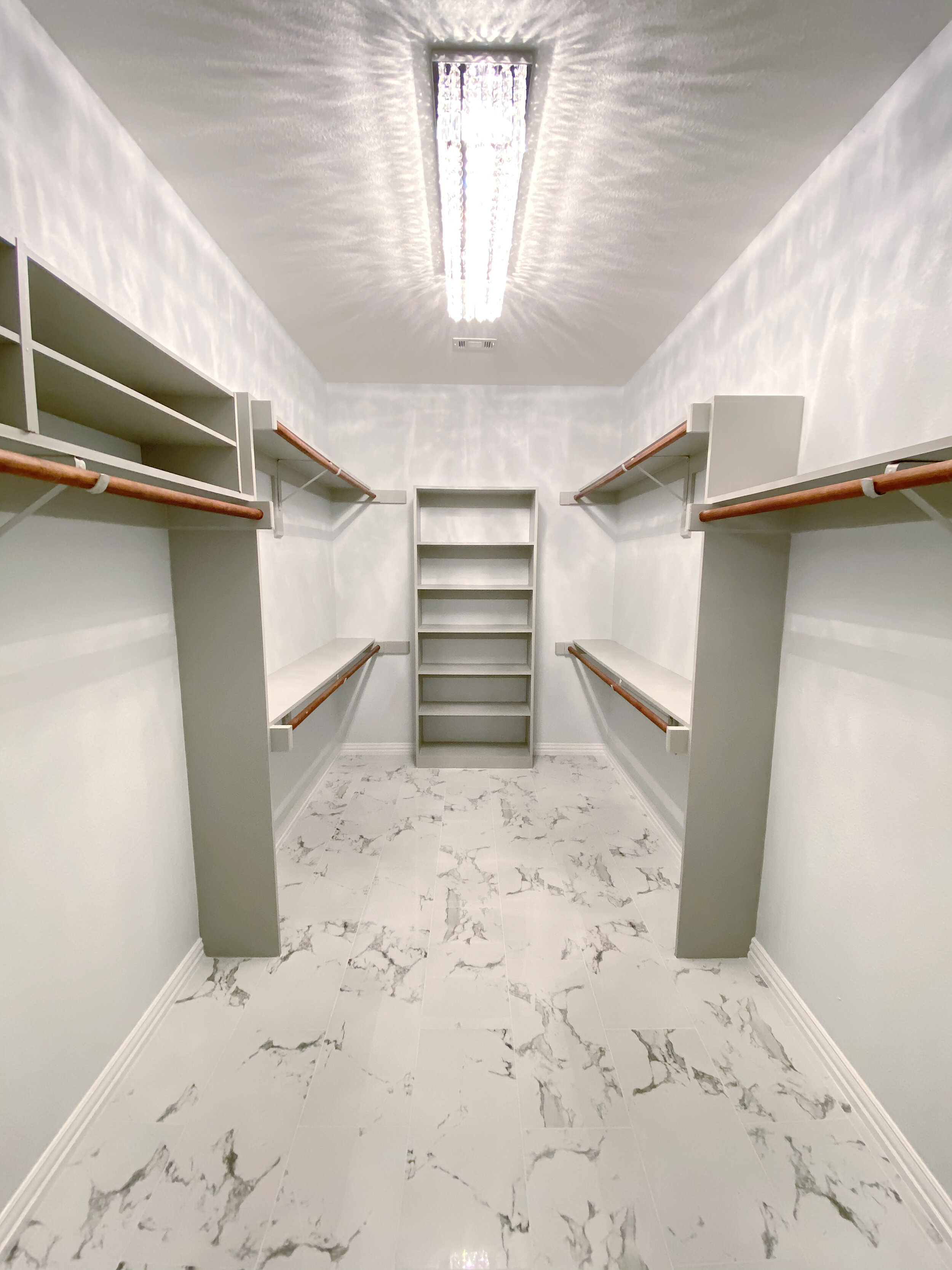
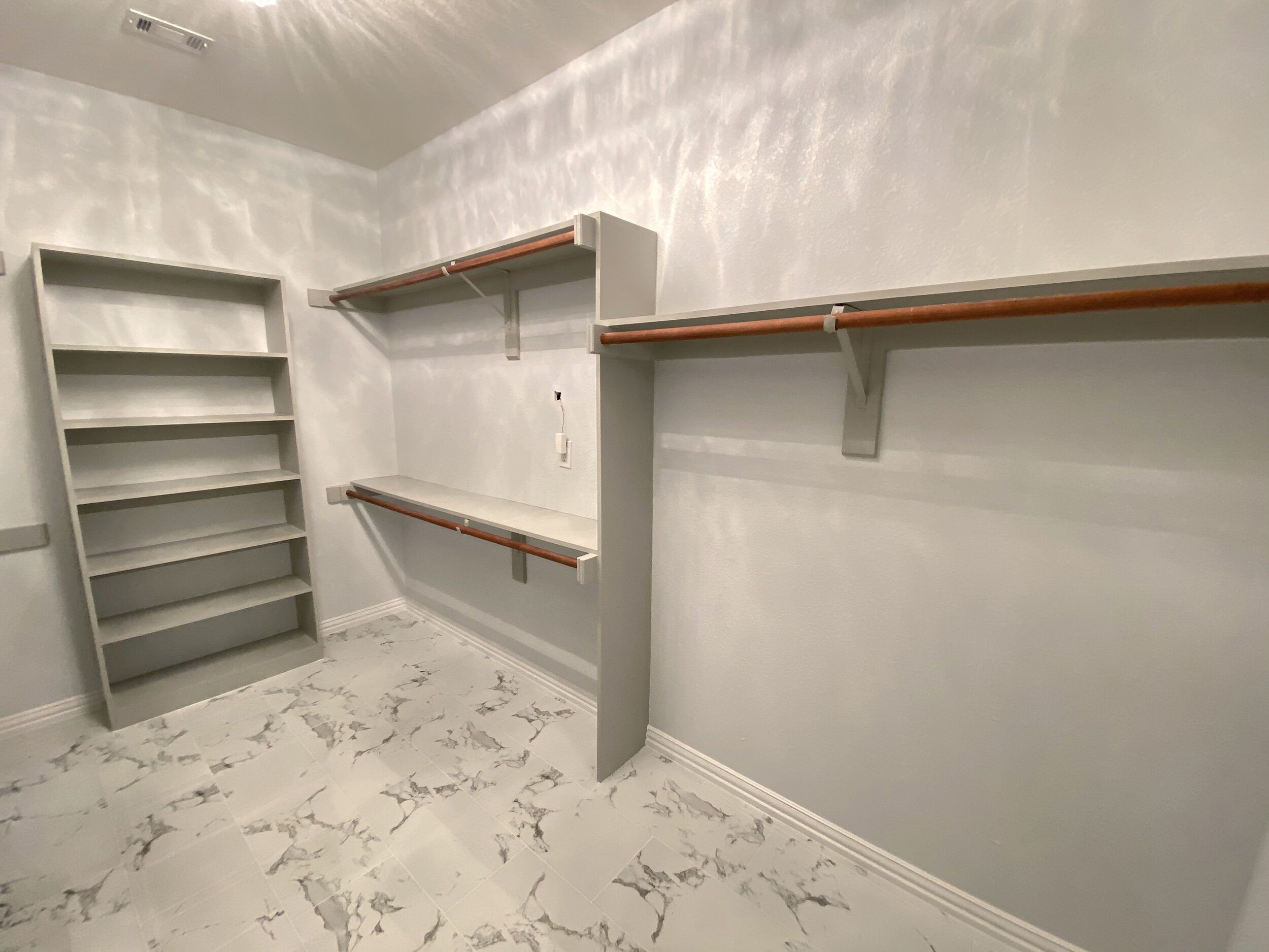
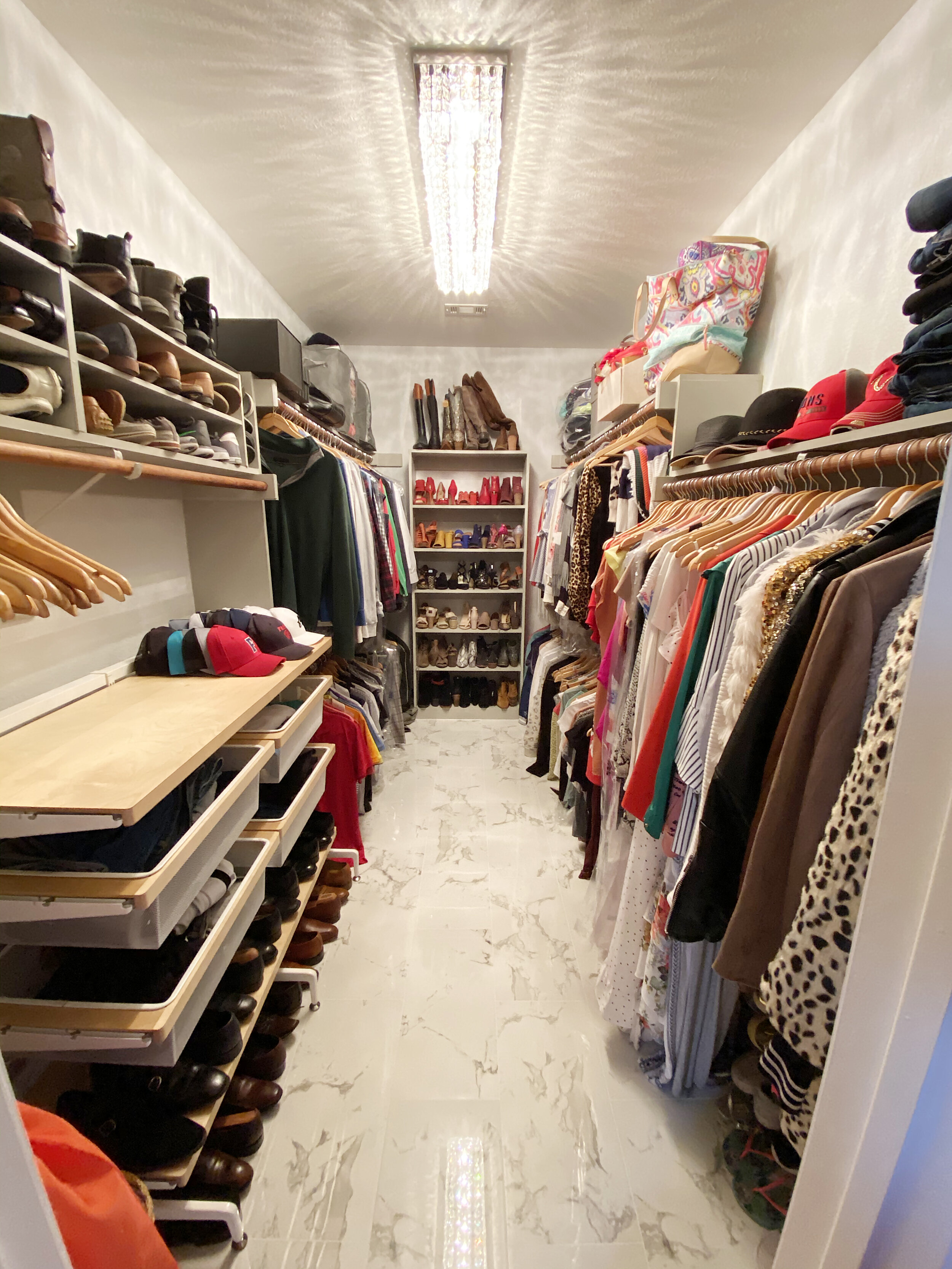
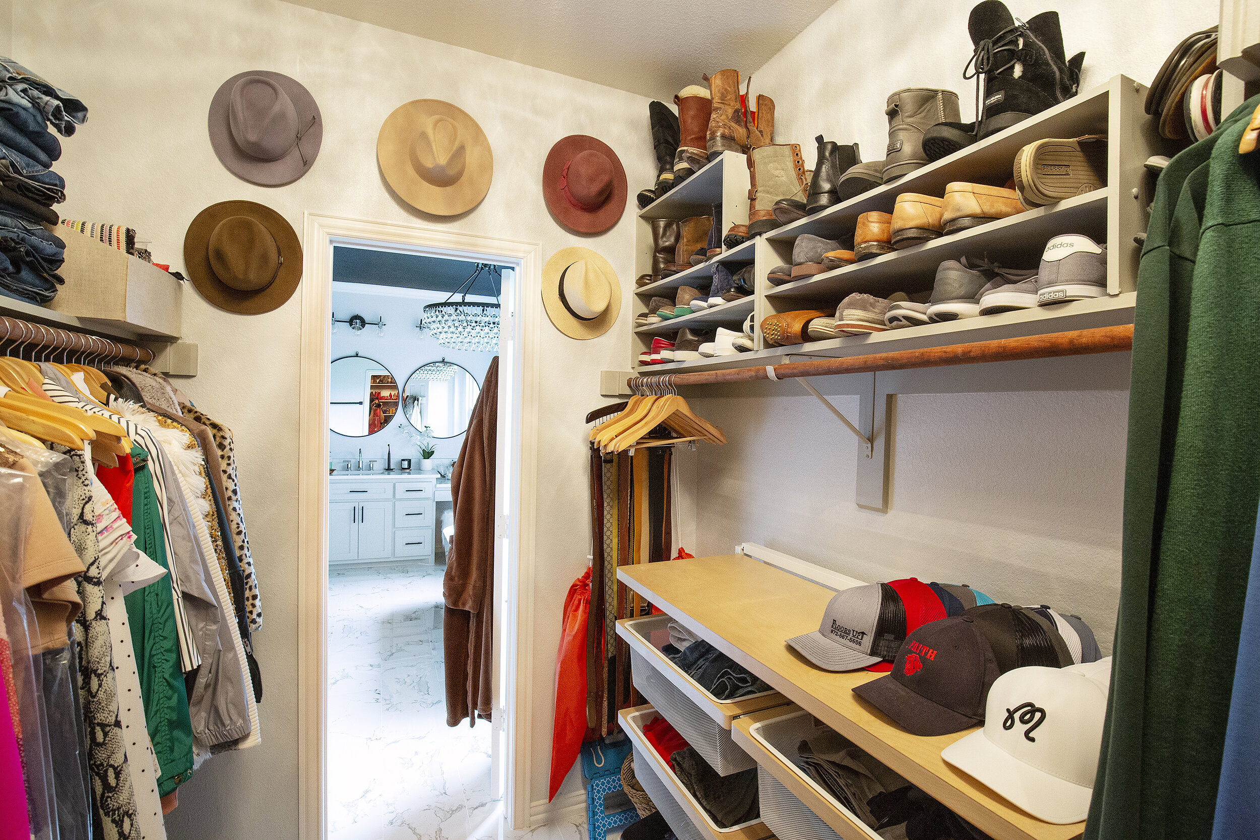
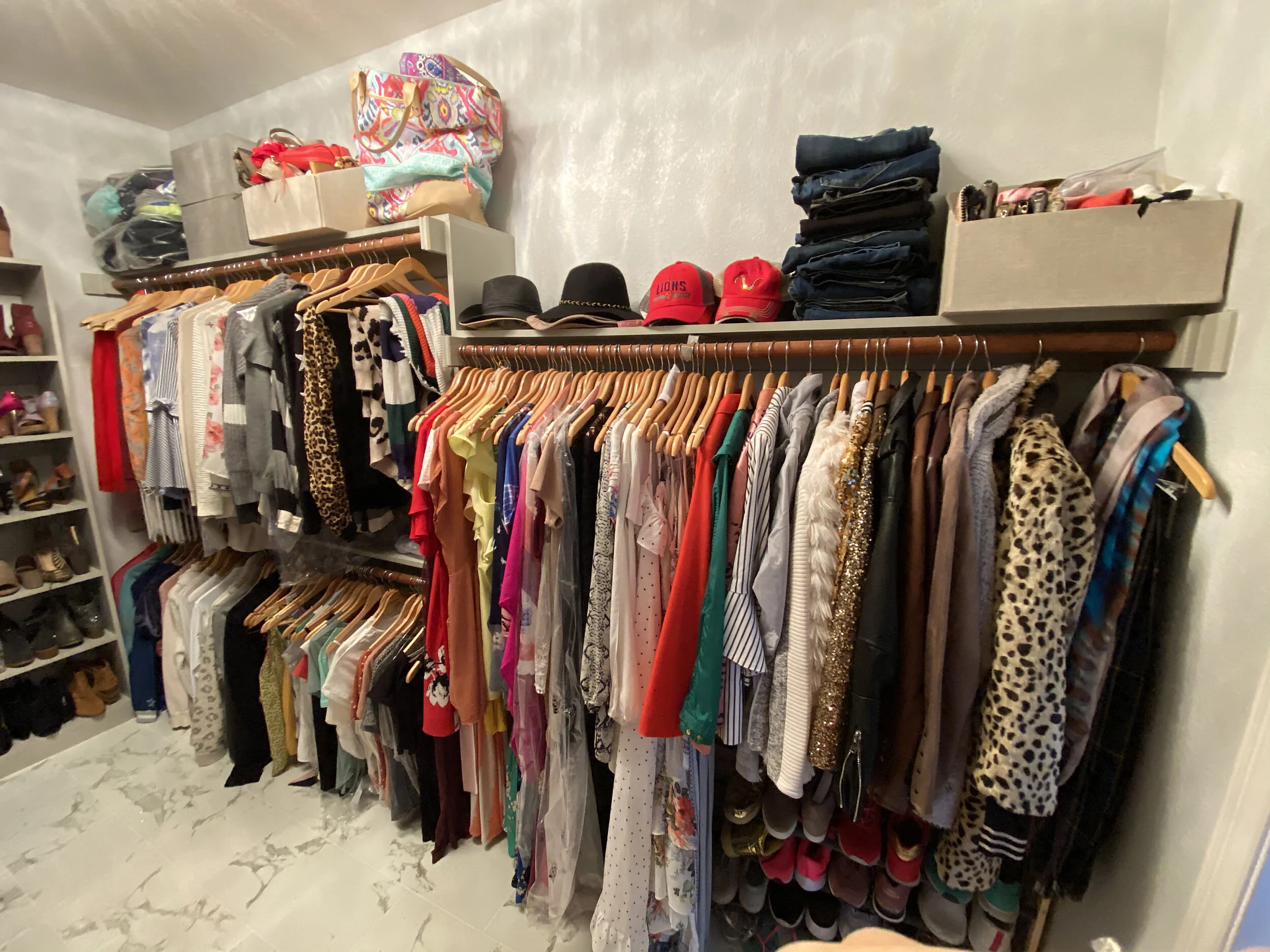
The second best part of the makeover was that the flooring and paint job continued into our closet! It’s crazy how flooring, a light fixture and some paint can totally transform a space. I can’t believe I didn’t take any “before” shots of the closet, but I found a couple of images from when we toured the house in 2012. So, just imagine same scene, different clothes and hangers. I think my favorite thing from the whole bathroom might be the light fixture in the closet. And of course that my sweet husband hung hooks for my major hat obsession! *Update - Tom sent me a picture he took so that’s in there too!
The “Before” (from previous owners)
The “After” empty
The final “After”
Side by Side shots
links to shop
If there is anything you loved from our makeover, I’ve got the links below! If it doesn’t have a link (most of the accessories) it was from our local Home Goods in Southlake.
Tub + Flooring came from Surplus Building Materials in Addison, TX
*Flooring is MSI Pietra Statuario: their product shot on their website looks beige, but it’s gray.
